City typography
Project summary
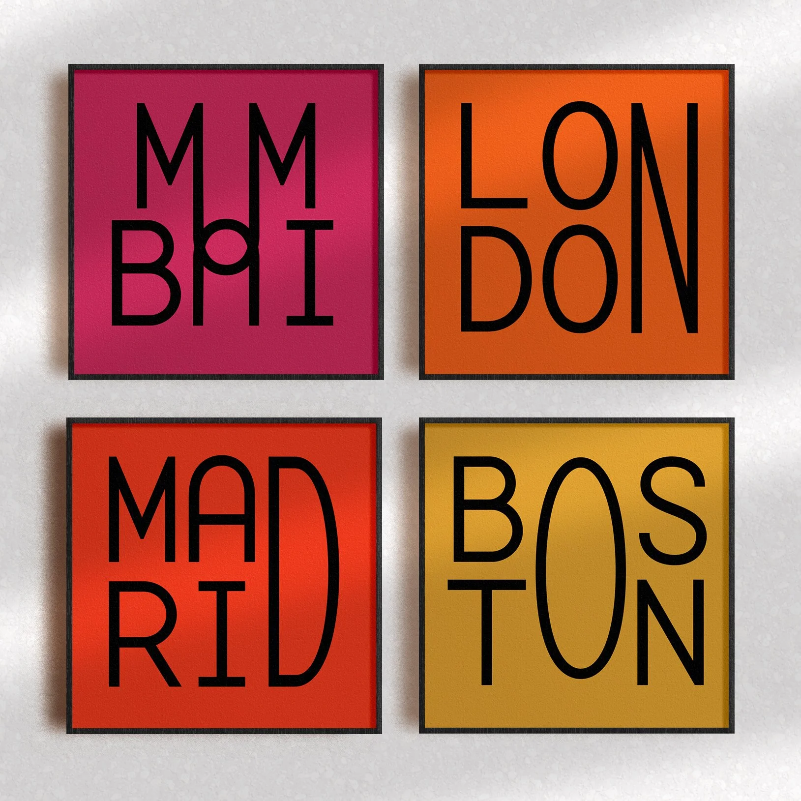
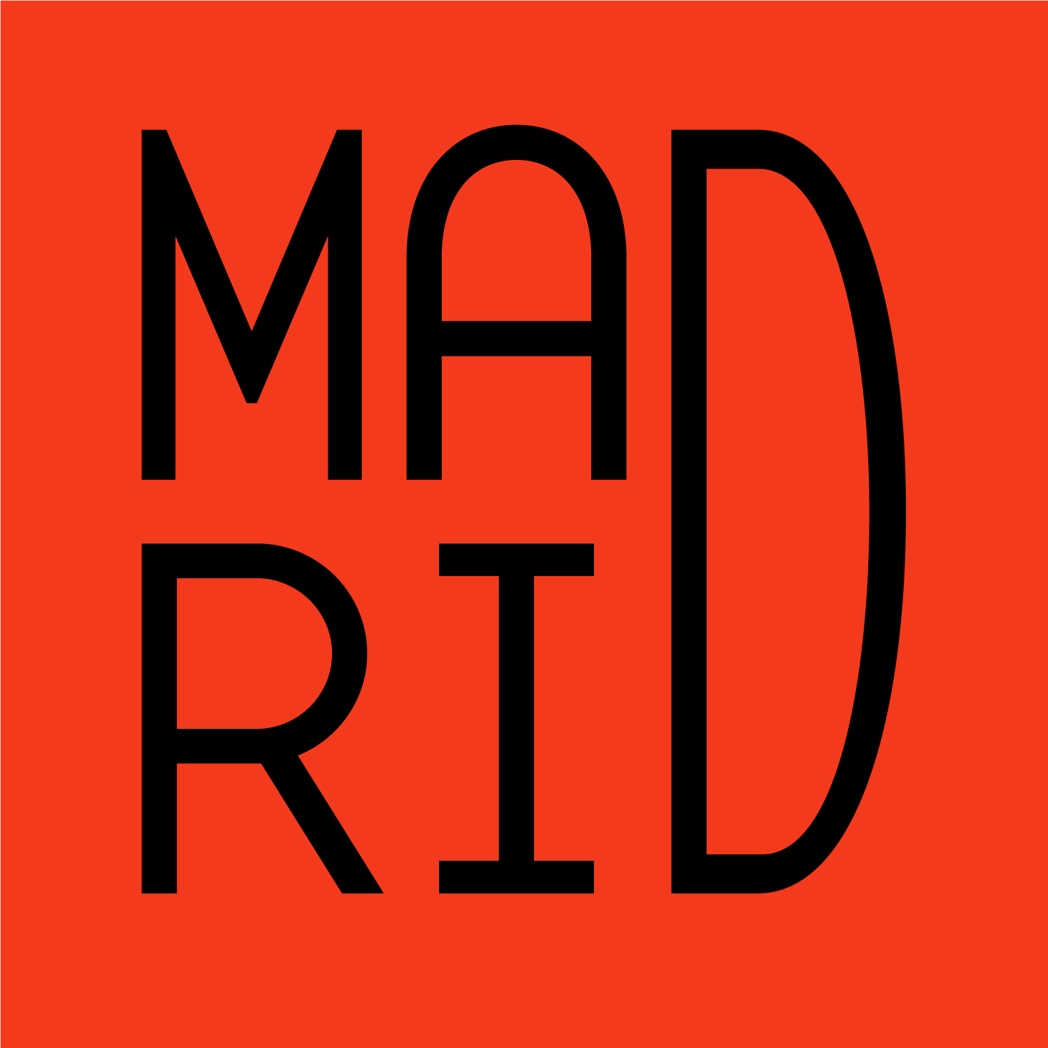
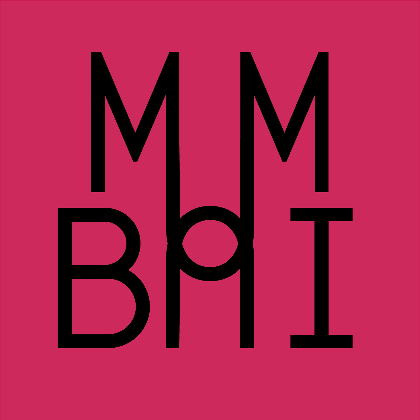
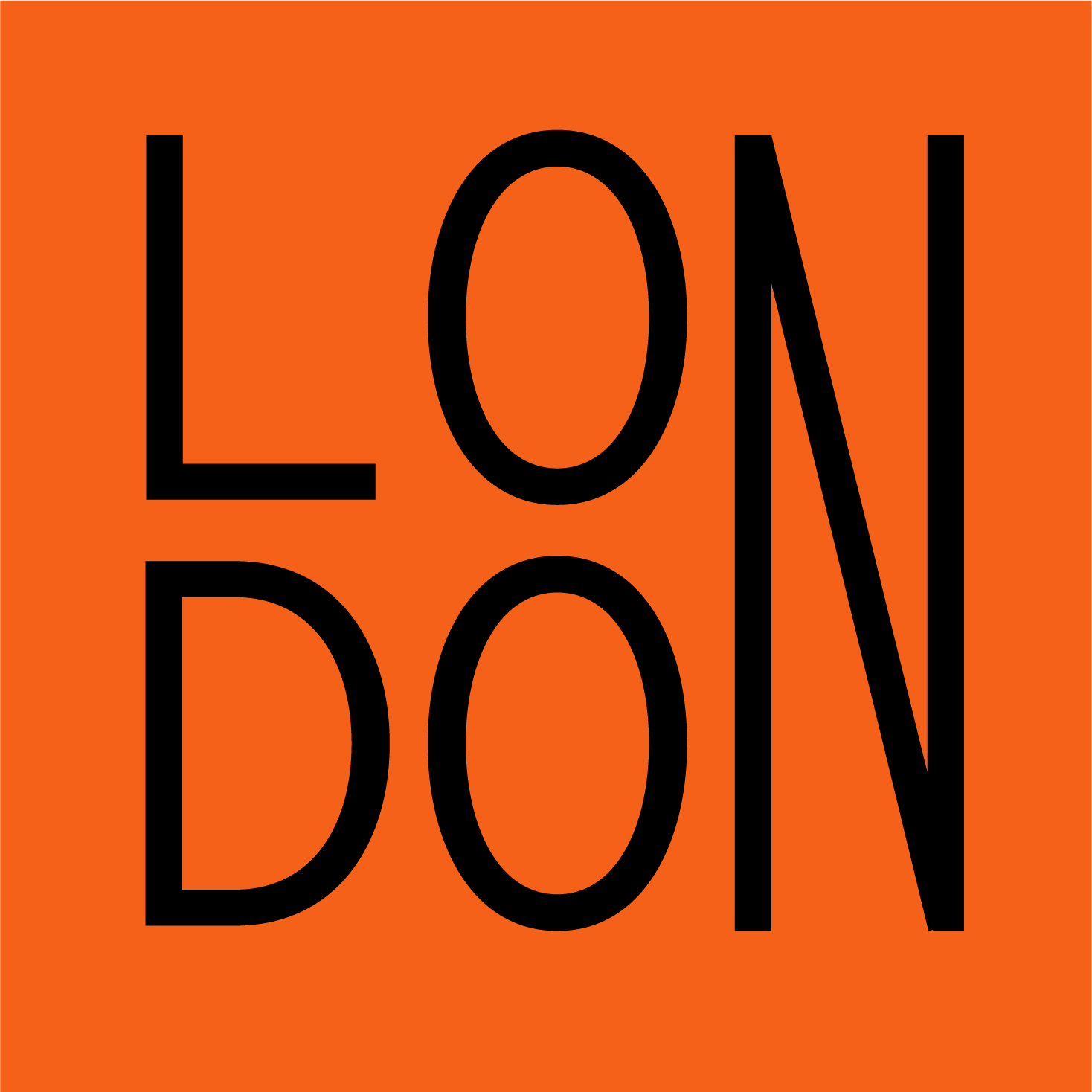
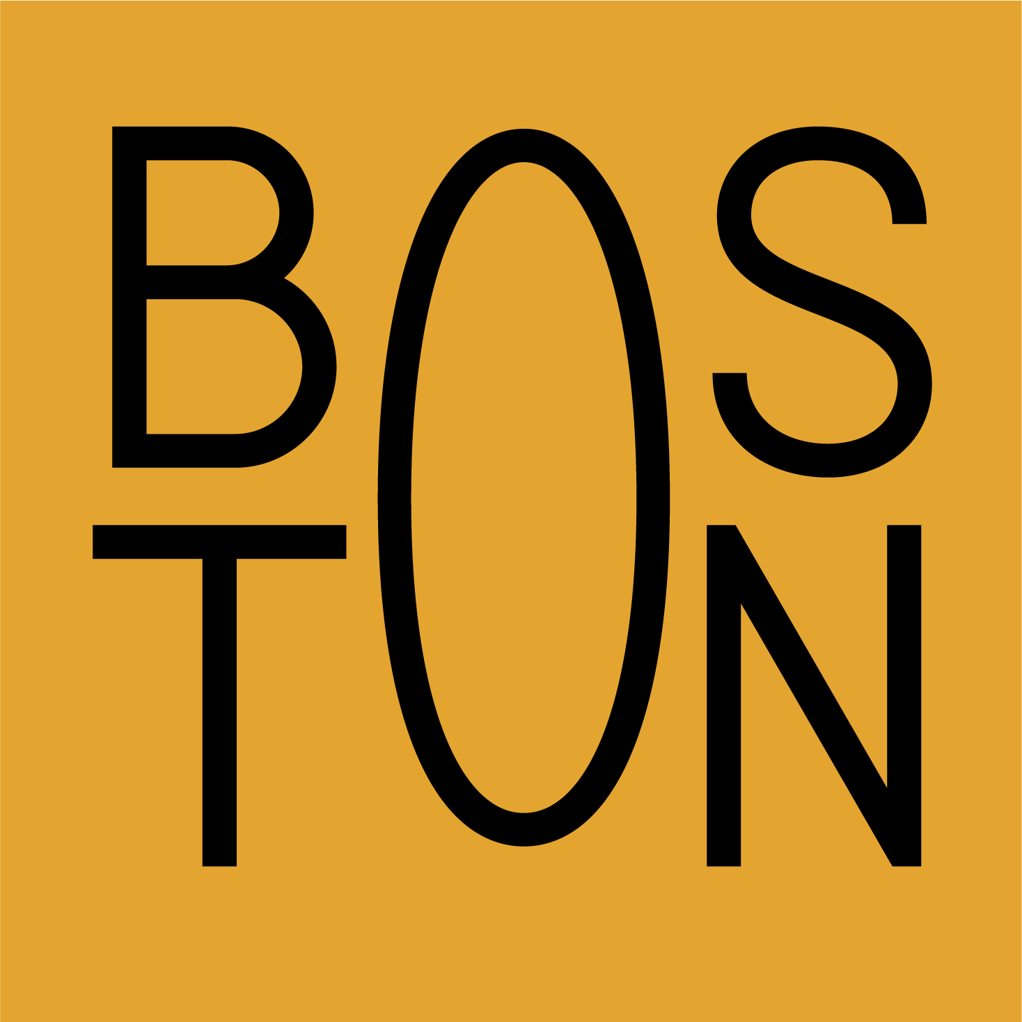
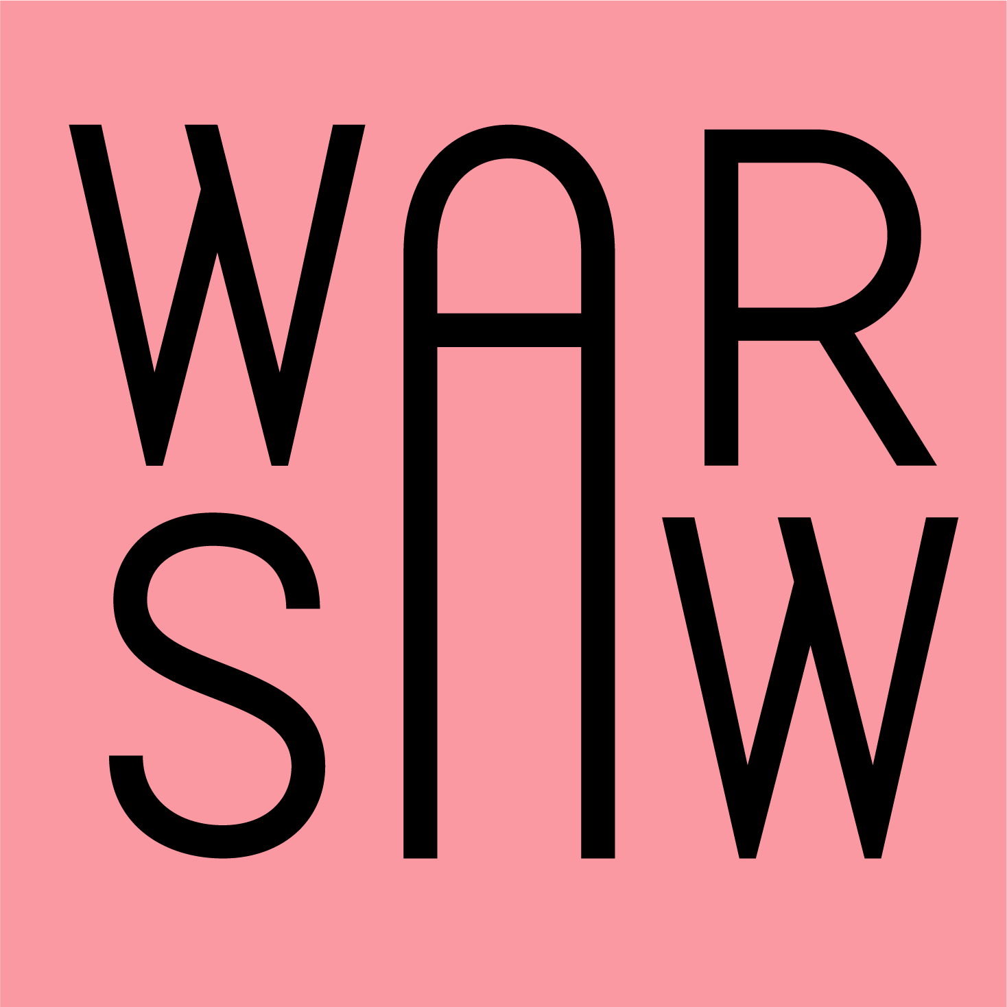
A self-initiated personal design project exploring city names through artistic typography and a bold colour palette.
Role and approach
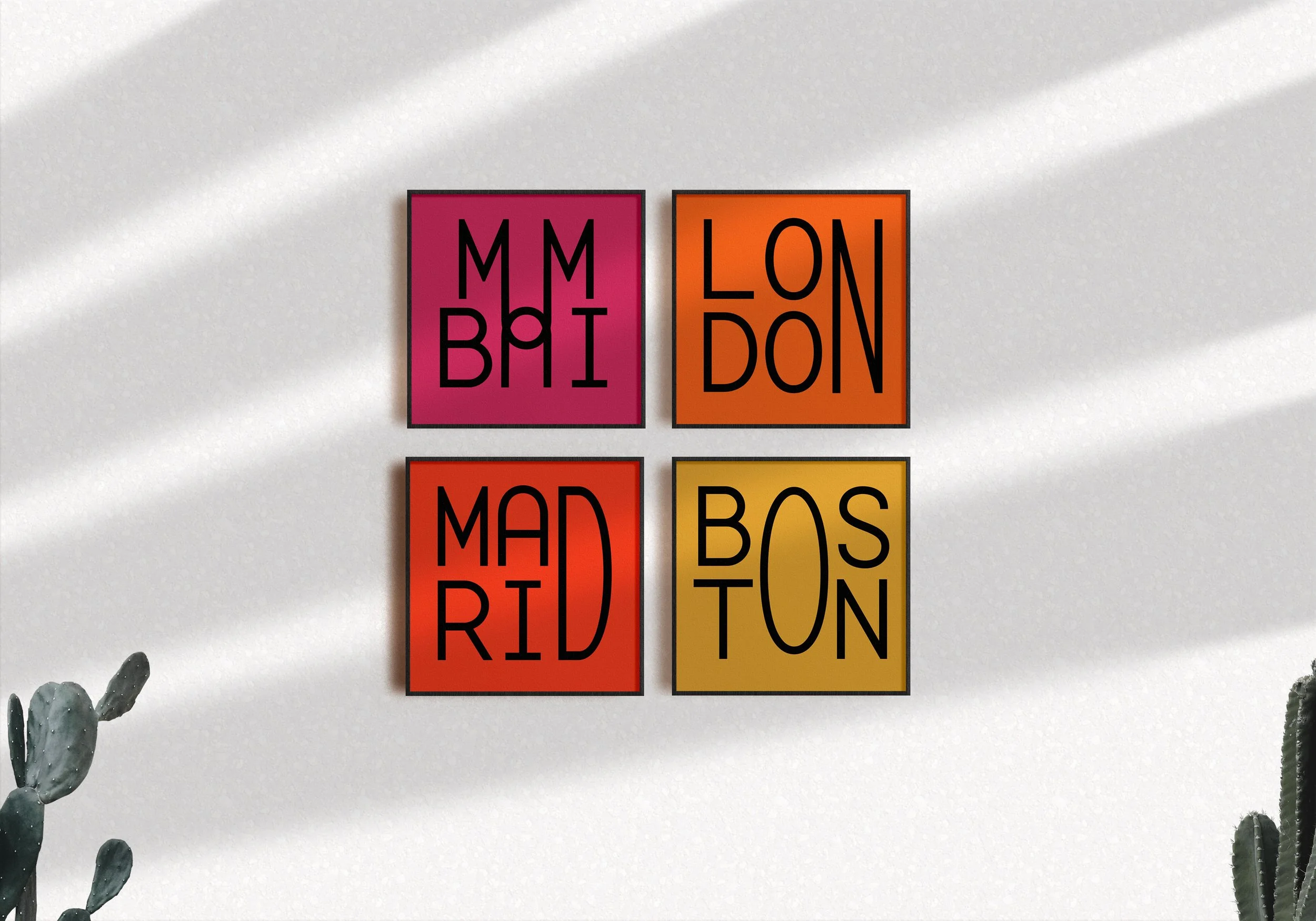
I started out by playing with designing iconic city names using various letterforms that were influenced by crisp lines and an Art Deco feel.
After finding compositions that worked, I paired them with a warm and bold colour palette to bring each slab to life. Each one works wonderfully on its own, while also functioning very well as part of a complete set.