
Brand Redesign | Opus Energy
Project summary
A complete rebrand of Opus Energy, a leading B2B energy supplier with a rapidly expanding customer base. This project included the following aspects:
A new logo and colour palette
A suite of branded templates and collateral
A brand management portal to host brand guidelines and assets


“Working with Sneha has been such a positive and inspiring experience. She has a wonderful way of bringing creativity, clarity and calm confidence to every project, while making the people around her feel listened to, supported and excited about what’s possible.
She asks the right questions, brings fresh ideas and always keeps the audience and the bigger picture in mind.”
— Kate D., Opus Energy
Role and approach
A new logo and colour palette
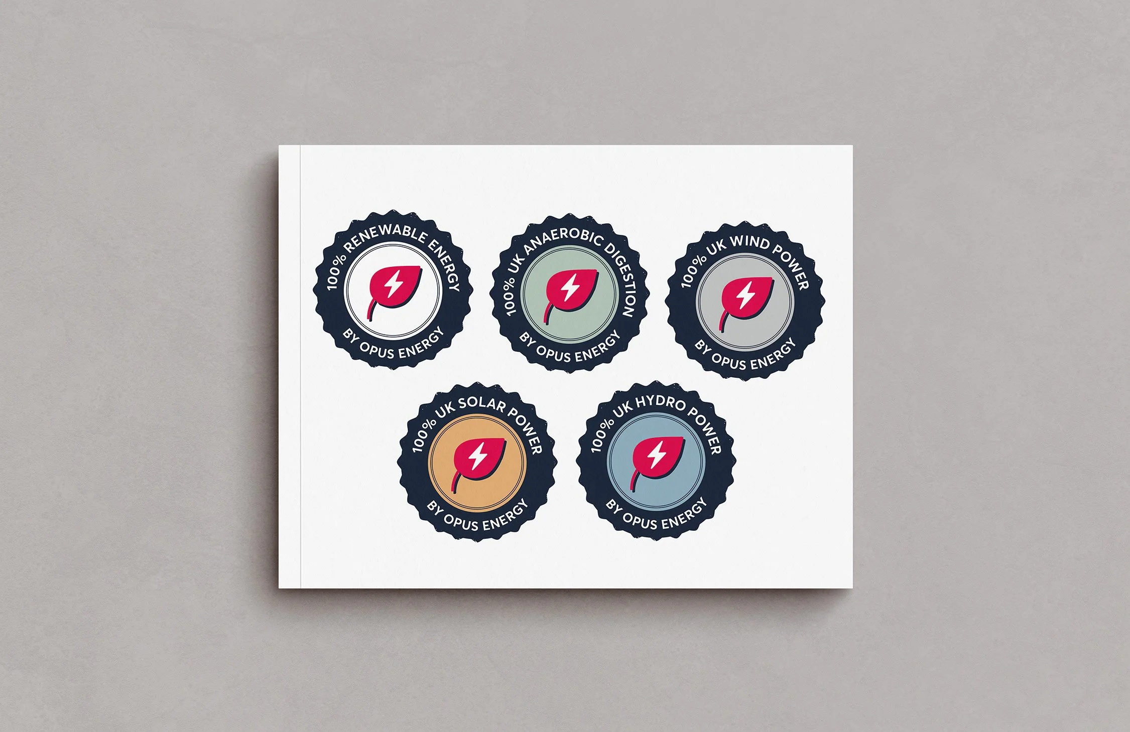
In addition to creating a new logo and a fresh and vibrant colour palette that would enable Opus Energy to stand out in a crowded and competitive market, I was also responsible for the visual identity of various sub-brand logos within the broader brand architecture.
Visual development of these aspects included designing in line with various use cases and scenarios, along with audience testing and stakeholder feedback.
A suite of templates and collateral
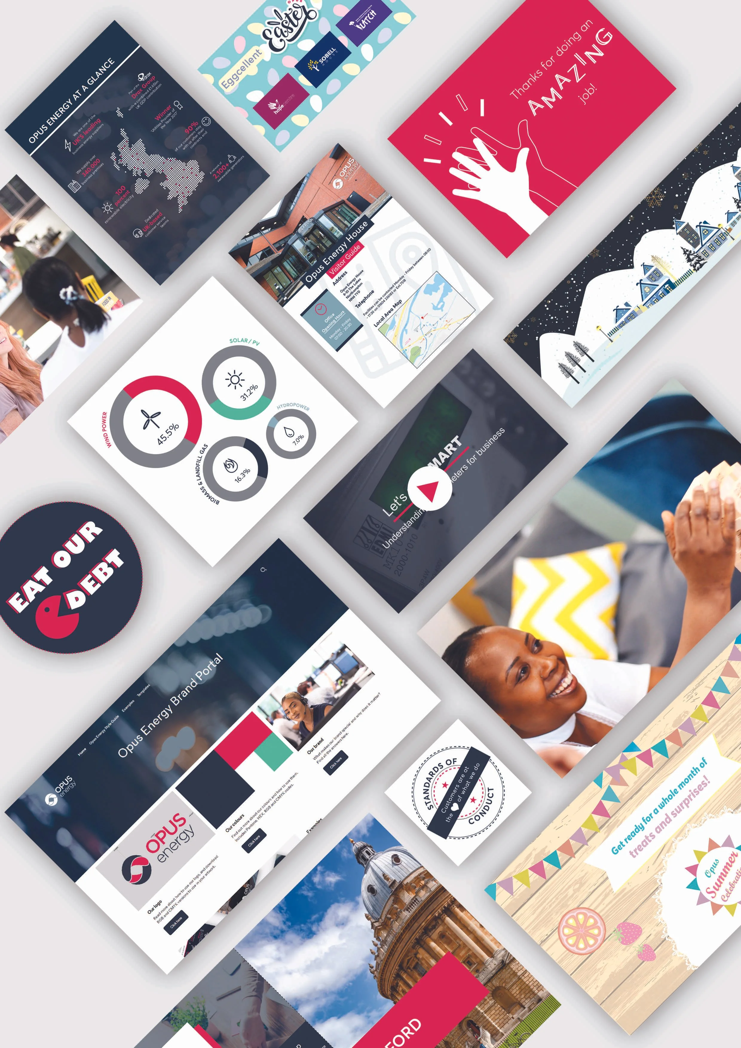
As a B2B energy supplier, Opus Energy brand usage spanned across corporate communications, marketing collateral and advertising campaigns. I led the design and delivery of a suite of rebranded templates, including brochures, social media, illustration style, graphic devices, powerpoint templates and more.
A brand management portal to host brand guidelines and assets
Prior to the rebrand, Opus Energy did not have a centralised brand guidelines system in place. Alongside developing the visual identity of the brand, I was also brought in to write the new brand guidelines and establish an all-new brand management portal to launch as part of the rebrand.
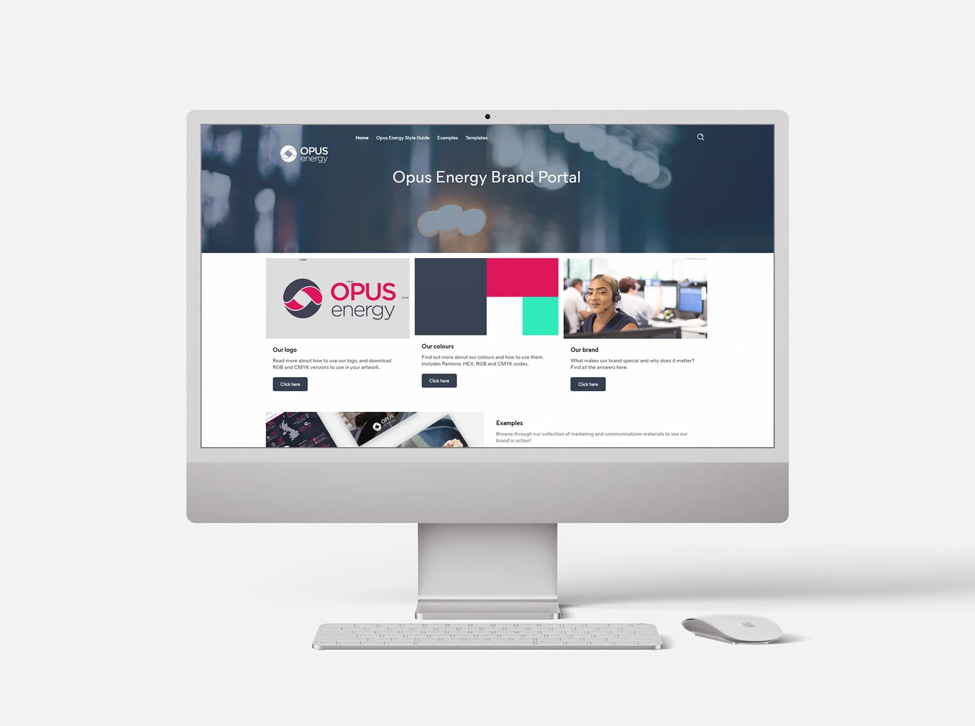
Brand management portal
Logo redesign
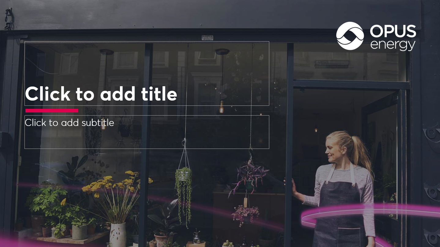
Branded powerpoint template

Newsletter design
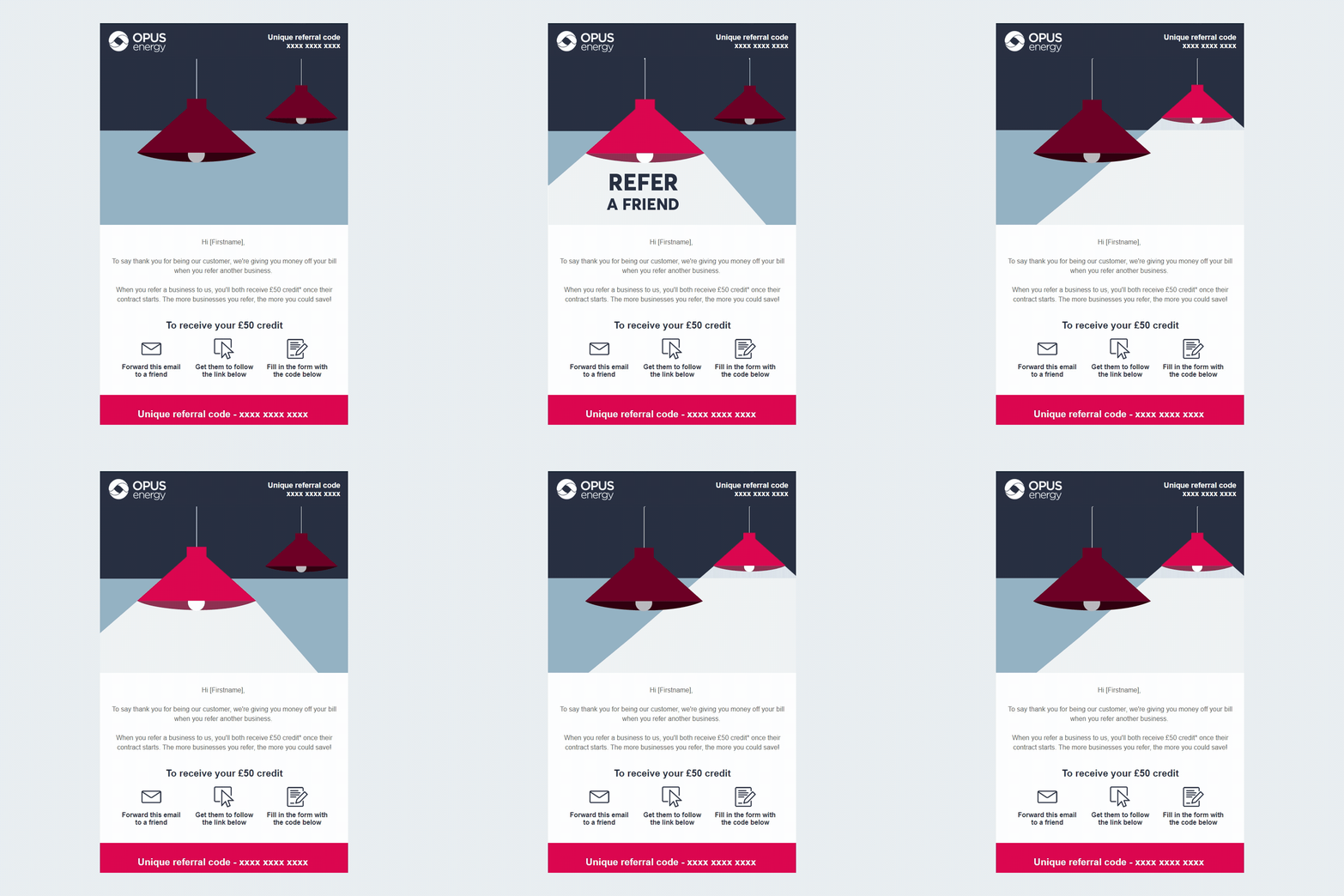
Recruitment marketing campaign creative
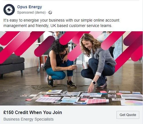
Paid social advertising

Social media templates
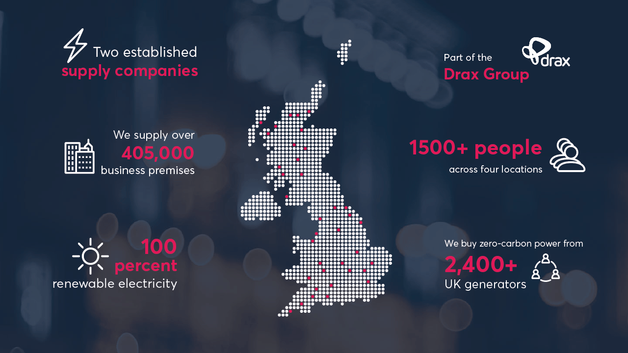
Branded graphic assets

Advertising campaign creative